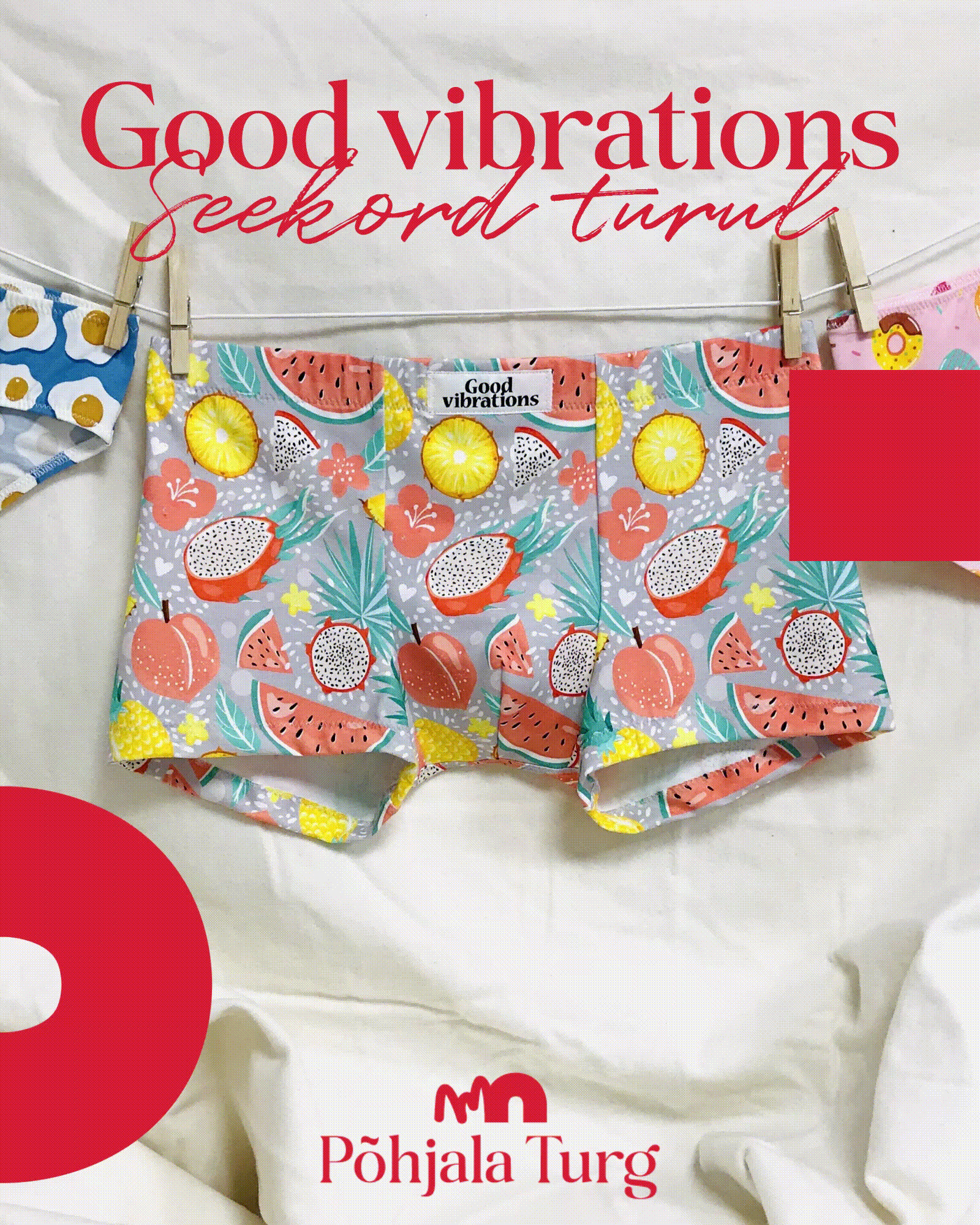
Põhjala Art & Design Market
A bold and playful visual identity for an art and design fair set in an old industrial factory, celebrating the creativity of its resident artists and designers. The concept balances the expressive freedom of artists with the structured precision of designers, combining vibrant colors and dynamic shapes with refined typography and orderly layouts. The logo draws inspiration from the factory’s iconic arched hangars, linking its industrial heritage to the now existing contemporary scene. Developed in a fast-paced two-week design sprint, the identity captures both the energy of the fair and the character of its historic setting.
visual identity
details
Põhjala Cultural Factory, Estonia 2025


CONTEXT
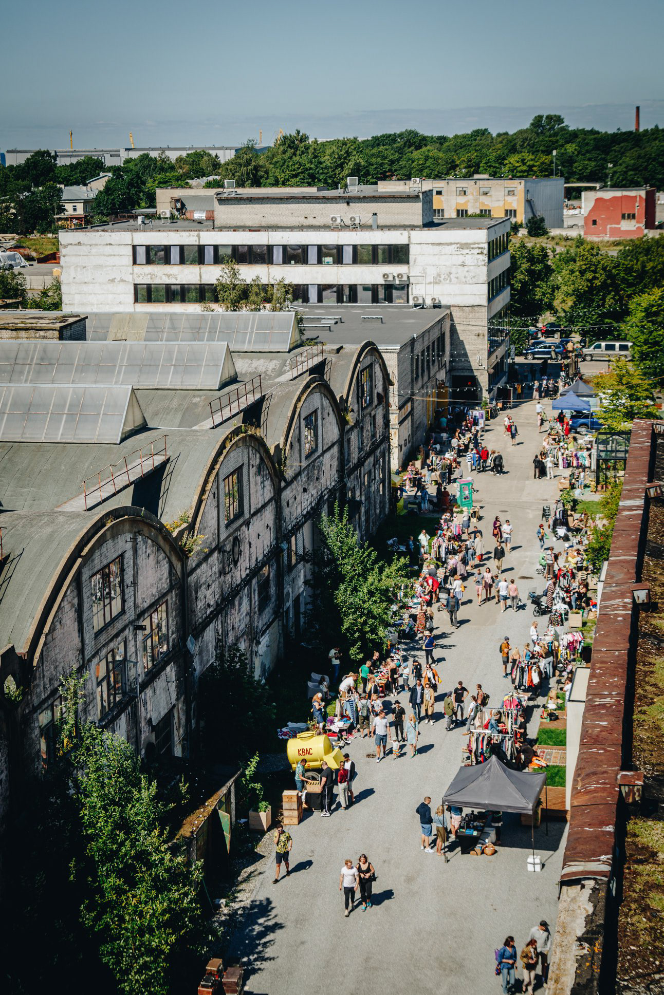
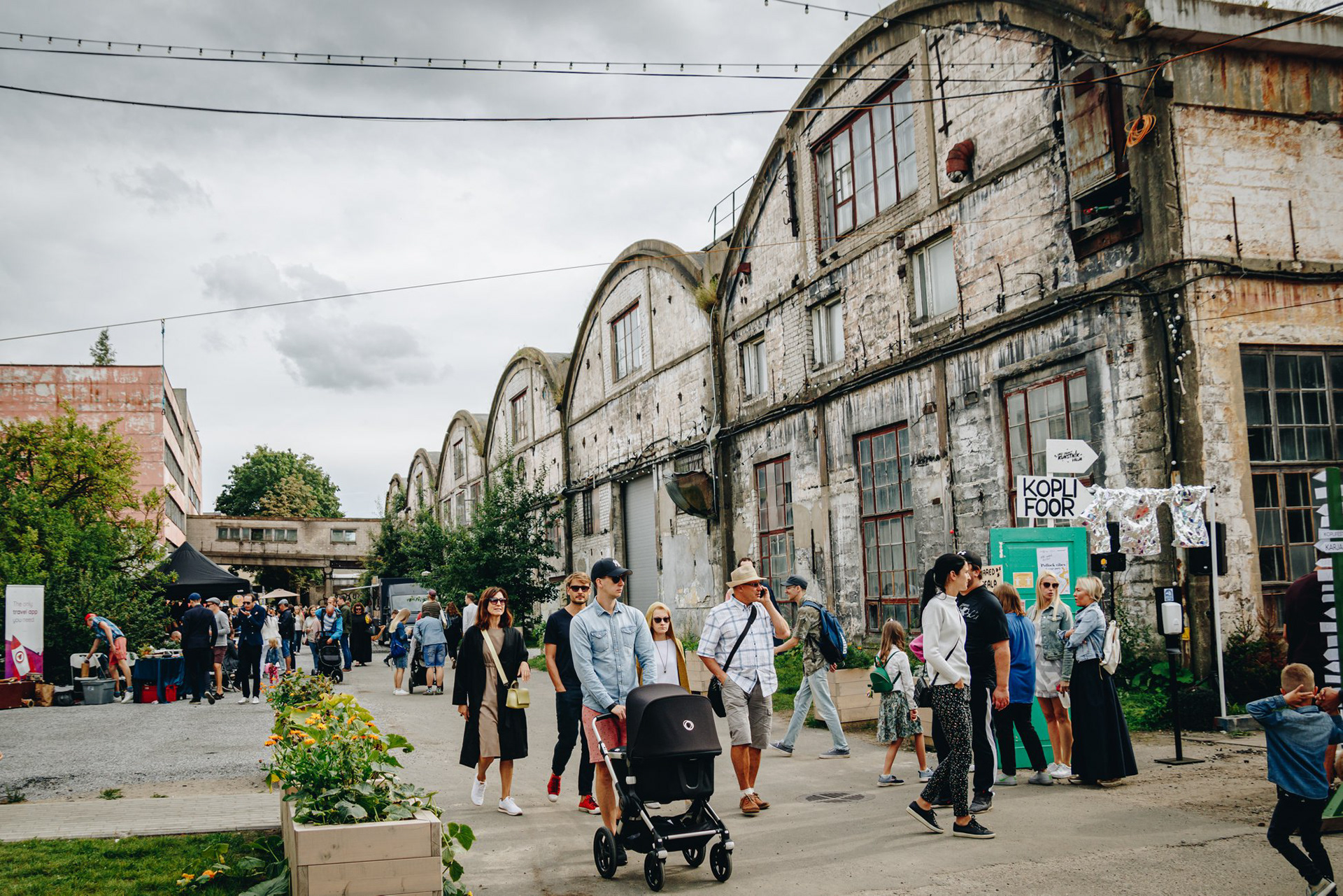
Põhjala Cultural Factory is a place where history meets creativity - once a leading rubber factory, this industrial space has now been transformed into a hub for artisans, designers, bookshops and restaurants. With its inviting spaces and cool events, the factory is emerging as a place-to-be.
For a few years now, the factory has been hosting fairs, drawing in new talents and growing crowds. As the community expands, so does the need for a cohesive brand identity - one that would help the market gain even more traction and helping the artists broaden their audience.
Photos by Põhjala Cultural Factory.
FIRST IDEAS
During our first meeting with the client, we defined the market’s desired atmosphere. As the client described it:
"In my dreams, Põhjala Market is a platform where creative individuals, artists, and passionate artisans can sell or showcase their creations. The vibe is cozy and charming, and the unique atmosphere of Põhjala Factory itself adds to its character."
From our discussion, I quickly visualized two playful yet distinct directions for the identity - one that reflected the current essence of Põhjala, and another that emphasized the factory’s unique, historical ambiance. Ultimately, in collaboration with the client, we decided to build on the first concept, incorporating industrial heritage elements to enhance its character. With this foundation set, I began refining the identity.

CONCEPT & MOTION
I based the concept on the contrast between artists and designers. Though closely connected, I see design as more methodical. Reflecting the market’s playful tone, I used distinct elements and fonts - art is colorful and flexible, while design is structured and precise. This is also visible in the logo - integrating the factory’s history with the concept aka by drawing inspiration from its most iconic structures - the arched hangars.
The concept also carries on into motion: design moves along clean paths, while art appears hand-drawn and spontaneous. The final logo follows the core concept while

CREATING THE GUIDELINES
Behind the scenes in my own brand identity “workshop” - piecing together the puzzle of how, why, and where every element fits. This system guides me through the final stages of the design process, right before creating the polished presentation and guidelines for the client.

THE FINAL IDENTITY
The final visual identity merges artistic creativity with design precision, featuring vibrant colors and dynamic shapes balanced by structured elements. The logo embodies this blend while referencing the factory’s history through its iconic arched hangars, resulting in a bold yet authentic aesthetic that connects past and present.